
10 Best Color Themes and Palettes For Instagram Success
Published on 25th of August 2025Excellent visuals make Instagram ‘go round.’ But, after years of posting images, videos, selfies, and more, you may feel like there are no more original ideas.
However, did you know you can use specific color themes and palettes to create different looks, even if you reuse evergreen content?
It is essential to pay attention to the templates and color schemes you use to succeed on Instagram. It is about not just having a uniform grid anymore but also attracting audiences who prefer specific visuals.
By creating a captivating Instagram look (or palette), you can make your brand instantly recognizable and get your followers oohing and aahing over every post.
Keep reading to explore some of the ten best color themes and palettes for Instagram.
Contents
- 1. Monochrome
- 2. Vibrant and Colorful
- 3. Earthy Tones That Align With Sustainability
- 4. Moody and Dramatic Themes
- 5. Pastel Dreamscapes
- 6. High-Contrast Colors
- 7. Vintage and Nostalgic Themes
- 8. There is Power in Minimalism
- 9. Cultural and Global Colors
- 10. Seasonal Themes
- Discover a World of Color on Instagram
1. Monochrome
Monochromatic color schemes are no longer just for movies and wedding photos. This color palette is timeless and elegant and involves various shades of a single color (usually black and white) to create a cohesive look.
The monochromatic trend means experimenting with shades of black and white and different hues or filters to convey different moods and messages.
Monochrome is a minimalistic approach and perfect if you want a clean and sophisticated look for your Instagram feed.
2. Vibrant and Colorful
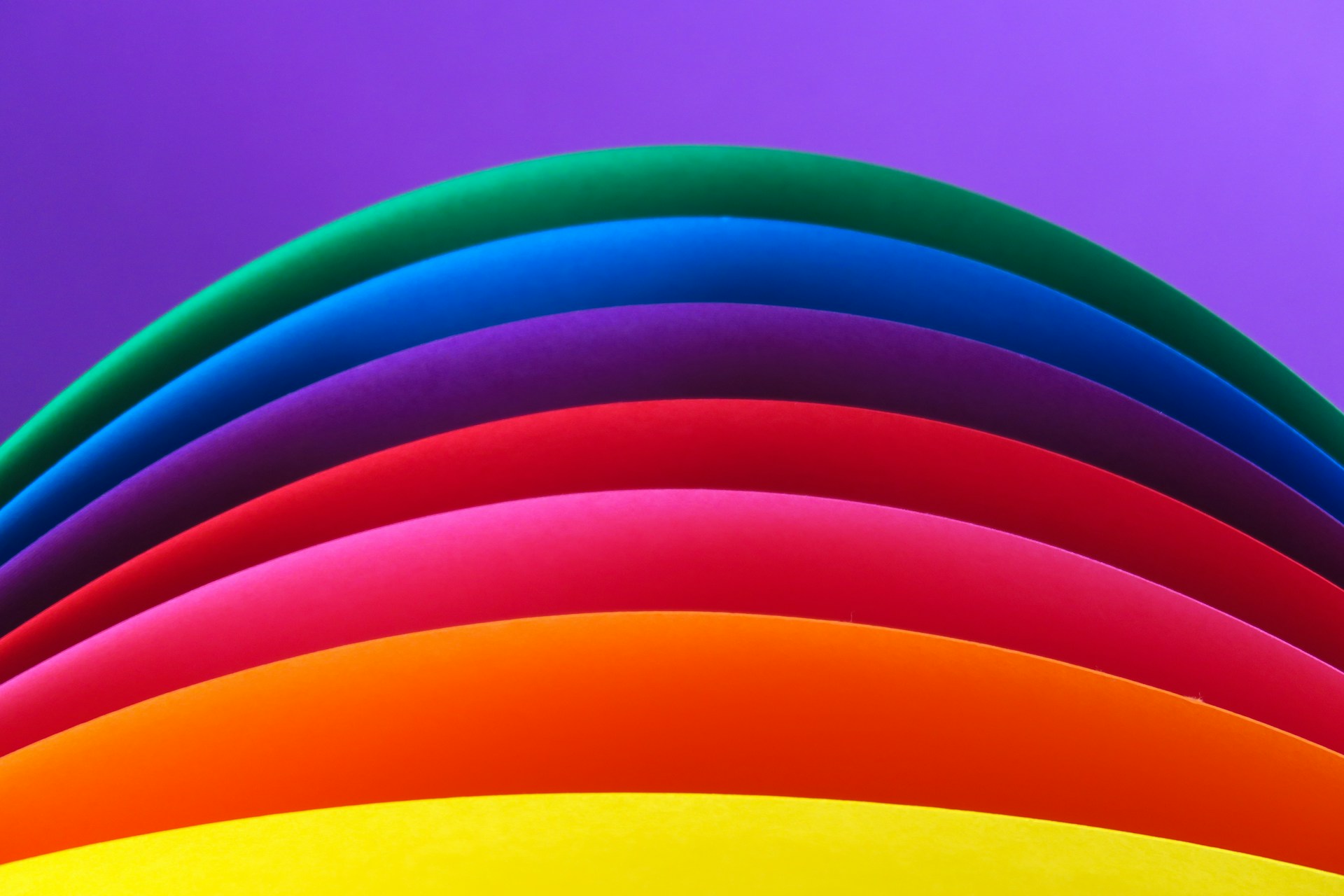 If you want an energetic vibe to your Instagram content and feed, you should turn to vibrant, bold color schemes. These color palettes continue to make a splash on Instagram in 2025, especially in feeds that promote makeup and fashion.
If you want to catch your audiences' eyes with your content, go for color blocks of screaming yellows, pinks, greens, and oranges. These colors may give you a headache if you paint them on your house walls, but on Instagram, they convey energy, excitement, and creativity.
You may notice these colors on lifestyle, fashion, and entertainment brand accounts. So, if your niche aligns with one of these categories, bold and colorful are the way to go.
3. Earthy Tones That Align With Sustainability
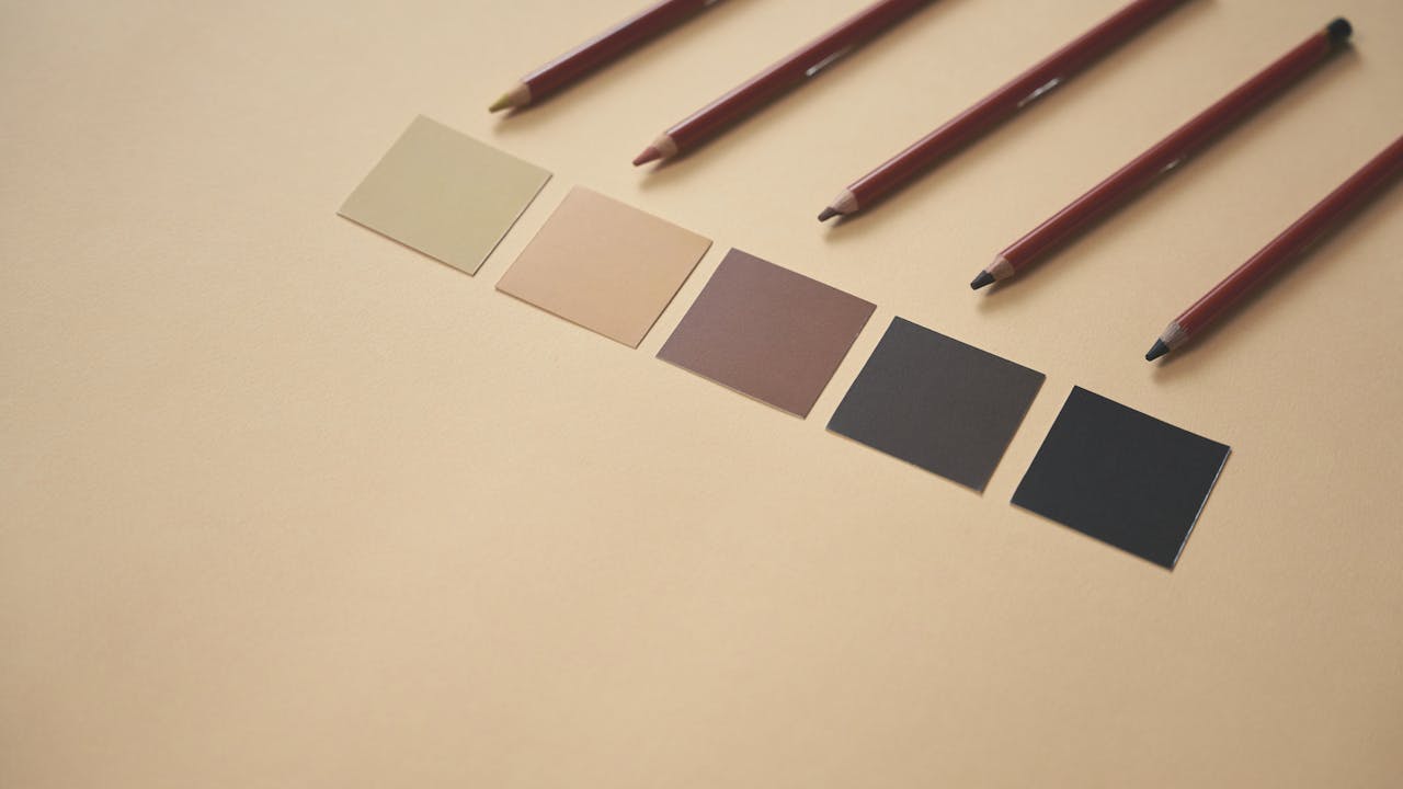 Is your brand sustainable and eco-conscious? You can reflect these values in your Instagram feed using shades of earthy tones like green, brown, beige, and off-white. And these color schemes are not as boring as they may sound.
If you incorporate different hues with an Instagram template or two, you will soon have Gen Z followers flocking to your feed.
Gen Z is the most environmentally conscious audience in the world right now, and if you get your earthy tones right (and stick to your green values), you can market your brand to them without a hitch.
Also, brands and influencers who promote sustainable practices can use these types of palettes to really connect with their audiences.
4. Moody and Dramatic Themes
If you are a horror or mystery writer, you will know the thrill of a moody color scheme. For a touch of drama when you release sneak peeks on your Instagram account, you cannot go wrong with deep blacks, dark blues, and rich purples.
Moody color palettes have long exuded both luxury and mystery, and you can use this to your advantage when promoting your new book.
These colors also work well for car companies or even perfume brands. If you are releasing a new fragrance, a mix of swirling, moody colors can also set the tone perfectly.
5. Pastel Dreamscapes
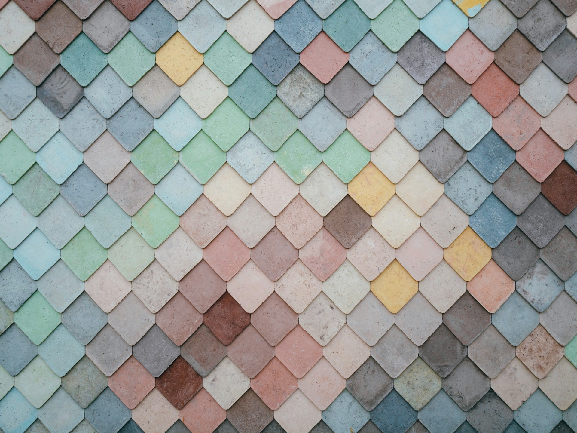 Pastel is the color of dreams, or so they say. So, even though the colors may invoke images of Barbie in her dreamhouse, they can also make your Instagram grid pop.
Pastel color themes have long been a favorite on Instagram and will continue impacting audiences in 2025 and beyond.
Dreamy pastel colors help create whimsical and delicate visuals perfect for promoting lifestyle, beauty, and interior design brands. And, if you have an ice cream brand, this color scheme will suit your business to a T.
6. High-Contrast Colors
Highly contrasting colors do not appeal to everyone, but if you use blue as the dominating color in your palette, you will find an audience who appreciates it.
High-contrast schemes are a bold choice, so if you want to make an undeniable statement on Instagram, choose visually striking colors and vivid opposites.
Brands and influencers favor this style because it depicts confidence and attracts a specifically targeted audience.
7. Vintage and Nostalgic Themes
.jpg) Nostalgia remains a strong influence on social media, especially on Instagram. You may have noticed trends coming and going that include 90s colors, 80s soundtracks, and 70s clothing.
Nostalgia remains a strong influence on social media, especially on Instagram. You may have noticed trends coming and going that include 90s colors, 80s soundtracks, and 70s clothing.
Past aesthetics inspire vintage color themes that invoke feelings of sentimentality. They often feature faded or warm colors and retro vibes, which makes them appeal to a larger audience.
8. There is Power in Minimalism
Minimalism and monochrome are not quite the same thing but they feature some of the same shades.
Minimalistic color themes are about simplicity and include neutral tones like white, gray, and black. You can combine these colors with a single accent color to achieve an authentic minimalistic look.
The idea behind minimalistic palettes on Instagram is to create a focal point ideal for professional brands.
9. Cultural and Global Colors
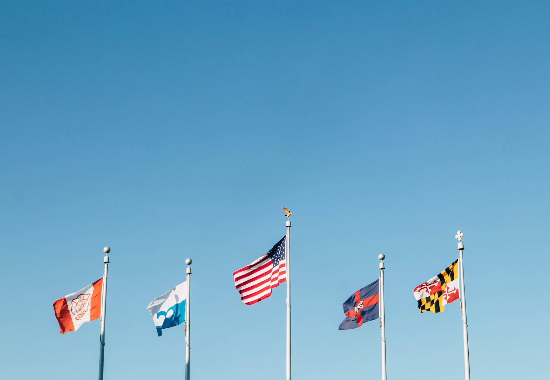 Just like on TikTok, diversity, and inclusivity reign on Instagram. It is important to use cultural or global color palettes to help convey a sense of unity and a celebration of different backgrounds and traditions.
These color schemes, which may be influenced by flag colors and other similar aspects, usually reign supreme during hyped-up sporting events like the FIFA World Cup and have also been known to turn some heads during global beauty pageants.
You can have lots of fun with these colors while showcasing diversity and unity.
10. Seasonal Themes
Seasonal themes are probably the most fun to work with. There is only so much you can do with colors based on specific holidays or seasons.
For instance, you can bring dramatic blacks and oranges for Halloween and soften them to rustic yellows, scarlets, and browns for Thanksgiving.
You can go full bright red and gold for Christmas and dial it down to pastel for Easter. Seasonal colors are some of the best ways to engage with your followers in 2025 and beyond.
Discover a World of Color on Instagram
Choosing the perfect color scheme on Instagram is more than having fun with shades and hues. It is a strategic decision that can help you retain your target audience.
So, discover your favorite colors on Instagram and make a lasting impression.
